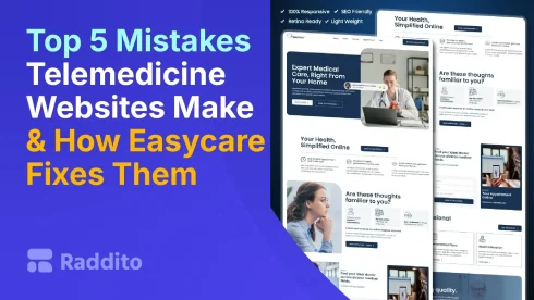
Telemedicine sites often fail to attract patients. Common errors like clutter, slow loads, and bad mobile views drive visitors away. But there’s hope. Raddito’s Easycare template tackles these head-on. It delivers clean, fast, user-friendly designs that boost success.
What Is the Biggest Design Pitfall?
Cluttered layouts confuse users. Too much info overwhelms.
Why Avoid Cluttered Design?
Patients want simple sites. Clutter leads to high bounce rates. Studies show poor UX causes 50% of users to leave telehealth platforms.
Easycare fixes this with minimal, modern styling. Built on Tailwind CSS, it keeps pages clean.
- Focused content sections.
- White space for easy reading.
- Intuitive layouts.
Raddito’s UI/UX expertise ensures this.
How Does Slow Loading Hurt Your Site?
Slow sites frustrate. Pages should load in under 5 seconds.
What Causes Delays?
Heavy images. Too many plugins. These kill speed.
Easycare optimizes for fast loads. It uses lightweight code and Elementor.
- Compressed assets.
- Efficient scripts.
- Quick server response.
This keeps patients engaged.

Easycare
Telemedicine & Telehealth Service Elementor WordPress Landing Page Template
Why Is Poor Mobile Experience a Killer?
Most searches happen on phones. Non-mobile sites lose out.
How to Spot Mobile Issues?
Pinch-to-zoom. Tiny buttons. These annoy users.
Easycare is mobile-first. Responsive design adapts perfectly.
- Touch-friendly elements.
- Fast mobile navigation.
- Full functionality on small screens.
Raddito templates shine here.
What About Bad Navigation?
Confusing menus lose patients. They can’t find what they need.
Why Fix Navigation First?
Good paths guide to bookings. Bad ones increase exits.
Easycare offers clear, simple menus. Easy to customize with Bricks Builder.
- Dropdowns for services.
- Search bars.
- Breadcrumb trails.
This improves flow.
How Do Unclear CTAs Miss Conversions?
Vague buttons like “Learn More” don’t prompt action.
What Makes CTAs Effective?
Bold, specific words. Like “Book Now.”
Easycare includes strong CTAs. Placed prominently.
- Color contrasts.
- Urgent language.
- Easy forms.
Boosts sign-ups fast.
FAQs
Clutter, slow loads, poor mobile, bad nav, unclear CTAs. They drive patients away.
With clean design, speed, mobile optimization, clear nav, strong CTAs. Premium features help.
Yes. Drag-and-drop with Elementor. No coding needed.
Expert in WordPress UI/UX. Free and premium for niches like healthcare.
Visit raddito.net. Browse and download. Start fixing your site today.